Background
Time
May.2021
Role
UI/UX designer
Tool
Figma
Overview
A hypothetical solution that provides people with an effortless and spontaneous way to build connections.
I designed the Meety app, which emphasises immediacy and distance range to simplify the networking process and enables people to connect more easily. This project started with user observation and research on existing social networking products. The goal is to improve the meetup experience and thus, encourage users to be more active in meeting new people.
Problem space
Wouldn’t it be great if we can connect with strangers more quickly and intuitively?
People get overwhelmed when they want to take the first step towards meeting new people from online platforms. People may have many concerns about time, social pressure and etc. It takes too much effort to start a simple connection.
Research
User interview
I interviewed 5 users from other social networking apps and also 3 interviewees who knew these kinds of products but had never tried them before. The followings were pain points I found from the interviews:
1. Too commercial, not comfortable
Some platforms have too many embedded advertisements disguised as activities. Or setting too many rules, making meeting unnatural.
2. Waste time waiting, not efficient
The process could be so long that users have to wait for the group leader to review their application. It wastes too much time waiting even for days. It is so uncertain and inefficient if users can’t quickly know the outcome of their application or if the activity has been cancelled after waiting. It is hard to arrange their schedule as well.
3. Stress for building relationships
Although users want to connect with people, they may not like to attend a long-term group like a club. Because they are afraid of the social pressure of maintaining relationships, introverted people find it difficult to take their first step.
💡Insightful opportunities:
Besides the problems above, I learned users might benefit from connections not only by joining a group or taking part in an event. Sharing and exchanging could be good purposes for meeting new people.
Persona

Emily / 21y / University student
Lively、Easy-going、Talkative
Emily majors in English. She loves outdoor activities and photography. She rents her own place with a dog. When she has free time, she enjoys walking her dog in a sunny day.

Lisa / 26y / Accountant
Introverted、Shy、Gentle
Lisa is working in an accounting firm since graduating from university. Her daily schedule is stable between home and office. She likes to go grocery shopping on weekends and recently started to learn how to make coffee and baking.

Eric / 32y / Programmer
Busy、Mature、Smart
Eric is a senior programmer in the technology industry and under a lot of stress at work. He learns Japanese on weekends and likes to drink with colleagues after work. He is interested in investing and financial management topics
Ideation
Design a flexible and stress-free activity APP to make meeting new people easy and relaxing.
1. Set time & distance limit: 1.5hr, 20km
Instead of a long time waiting and a wide distance range, we meet by serendipity when you turn on MEETY. Without purposely making a plan, it shortens the time for the group leader to check applications. It makes encounters more casual and flexible, and users can have small talk with others or extend their conversation.
2. Mutual benefit with strangers and increase the willingness of using
It is trendy that sharing economy enables the optimization of resources by mutualizing the excess capacity in goods and services. By using the ‘sharing’, ‘exchanging’ or ‘grouping’ modes there could be different combinations. Other than making friends, there are many choices to diversify this community and increase the number of users.
3. Active or passive, all up to you
Meeting face-to-face is faster and more direct than prolonged talking online. Users don’t have to be worried about being awkward or too shy, because users can choose to be a group leader or wait for others’ invitations. Just like meeting in the real world, it’s easier and more casual to use MEETY than organising a big group.
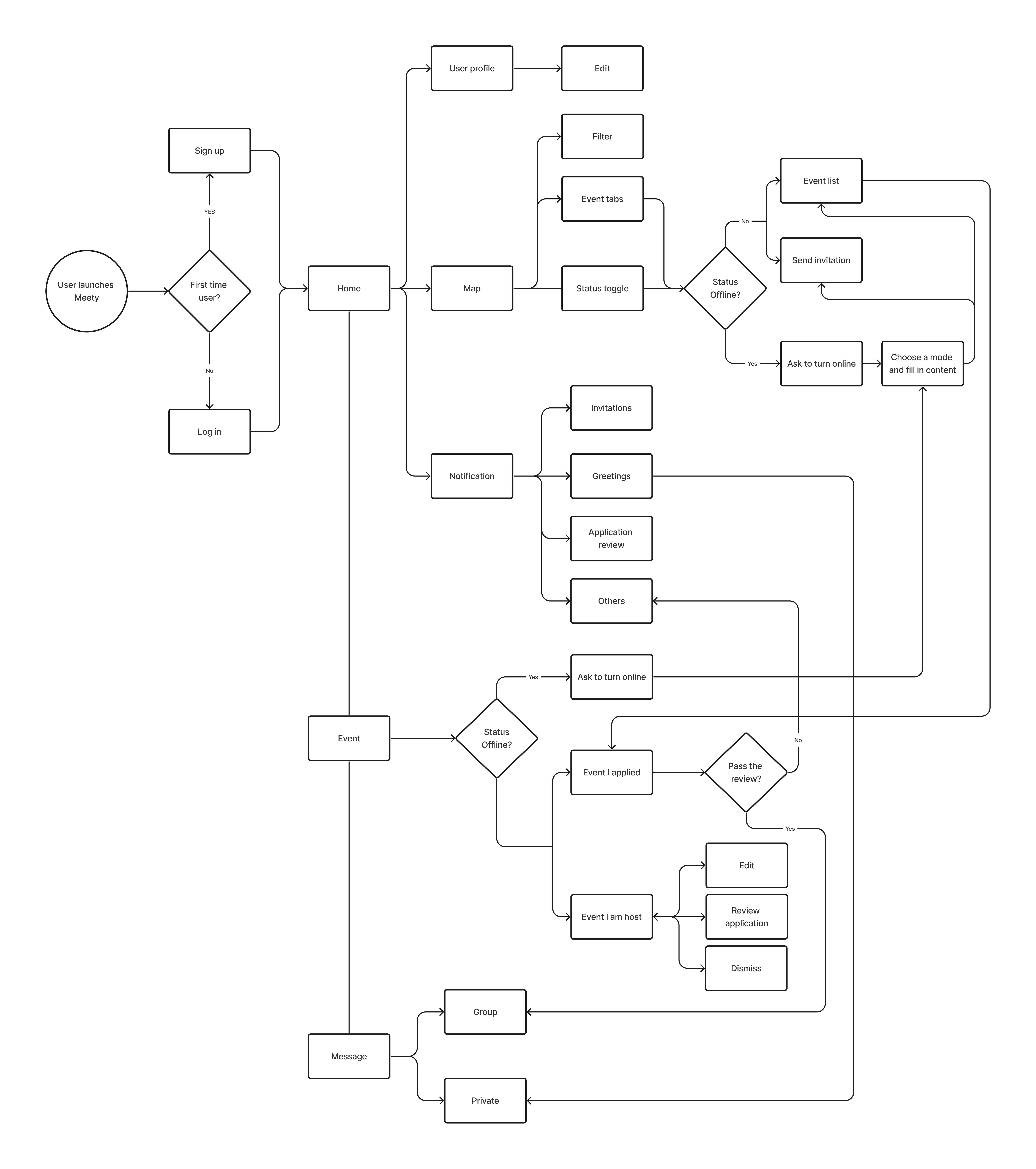
User flow
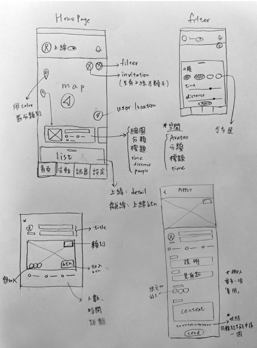
Wireframe


Prototype
Home
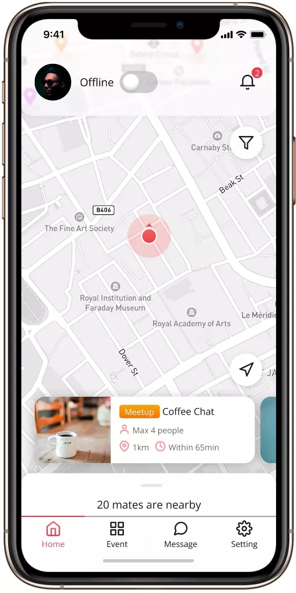
Default state: offline
It shows a map when you first click into the app and keep you offline by default. However, you can still browse other online users around you within 20km maximum. You can also filter through different modes, distance, or activity deadline to see more specific options. This allows users to explore freely. If you want to check more details or join the activity, just turn your status online when you are ready anytime.
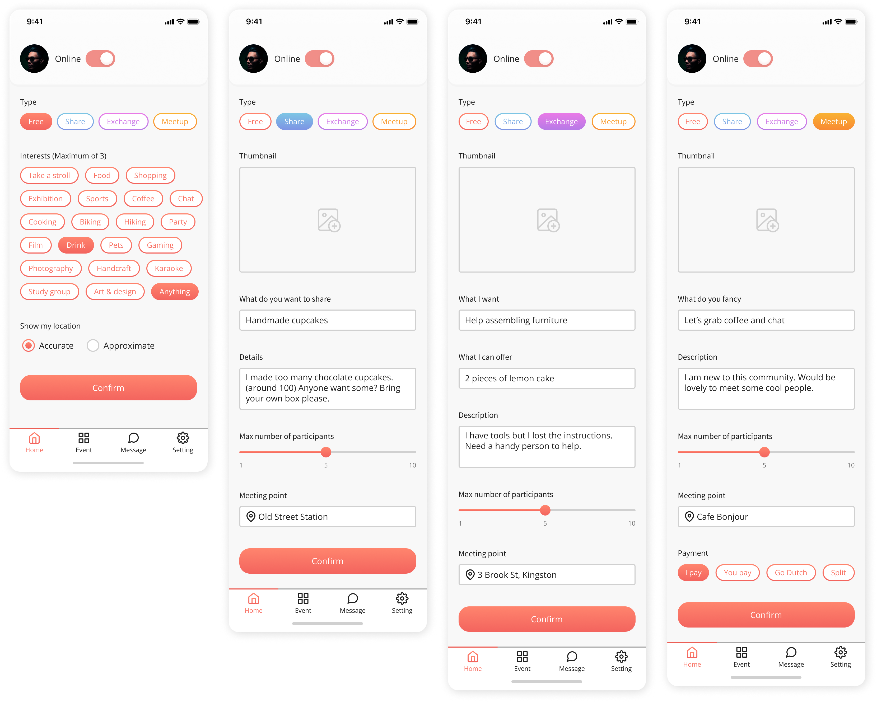
Turn online
After you turn your status online, you have to choose one of four types ‘free’, ‘share’, ‘exchange,’ or ‘meetup’. Only ‘available’ is a passive status which requires users to be invited, other statuses can be the host for different purposes. The online status will be closed after 90 minutes. You have the choice to show your location specifically or roughly to protect your privacy and the activity detail could be edited on the activity page after you create it.
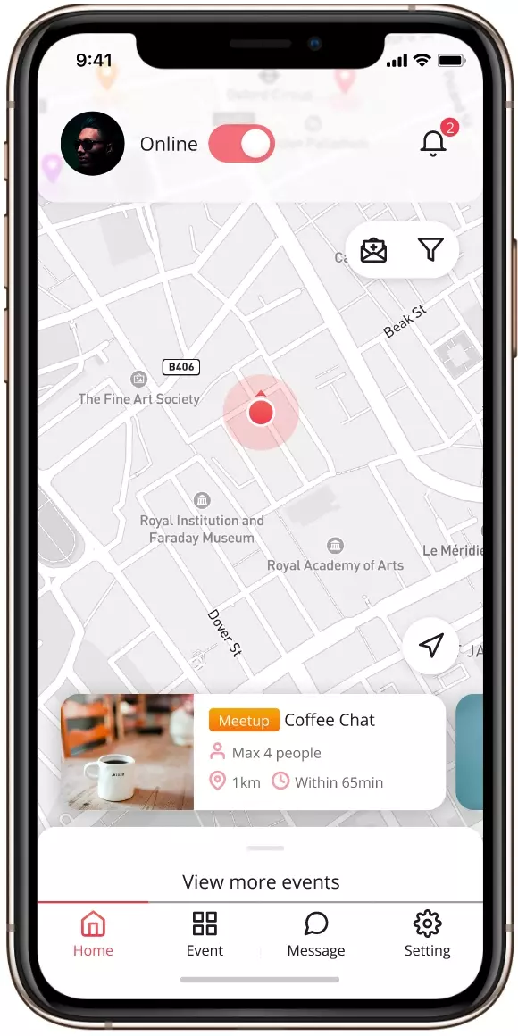
Homepage with online status
After turning yourself online, you are able to browse all activities and details within the valid range. You could also invite other users to join your activity, but are only allowed to apply for one type of activity at a time.

Personal page
Click on the top left avatar to check and edit your personal page. It shows your current activity status and how many likes you have received by hosting activities before. You can follow your interested users and once they hold a new activity you will be notified. The small dot with a different color on the bottom right of the avatar corresponds to user’s current state. If the person is available, you can send a greeting message and chat with each other after being reviewed.
Event
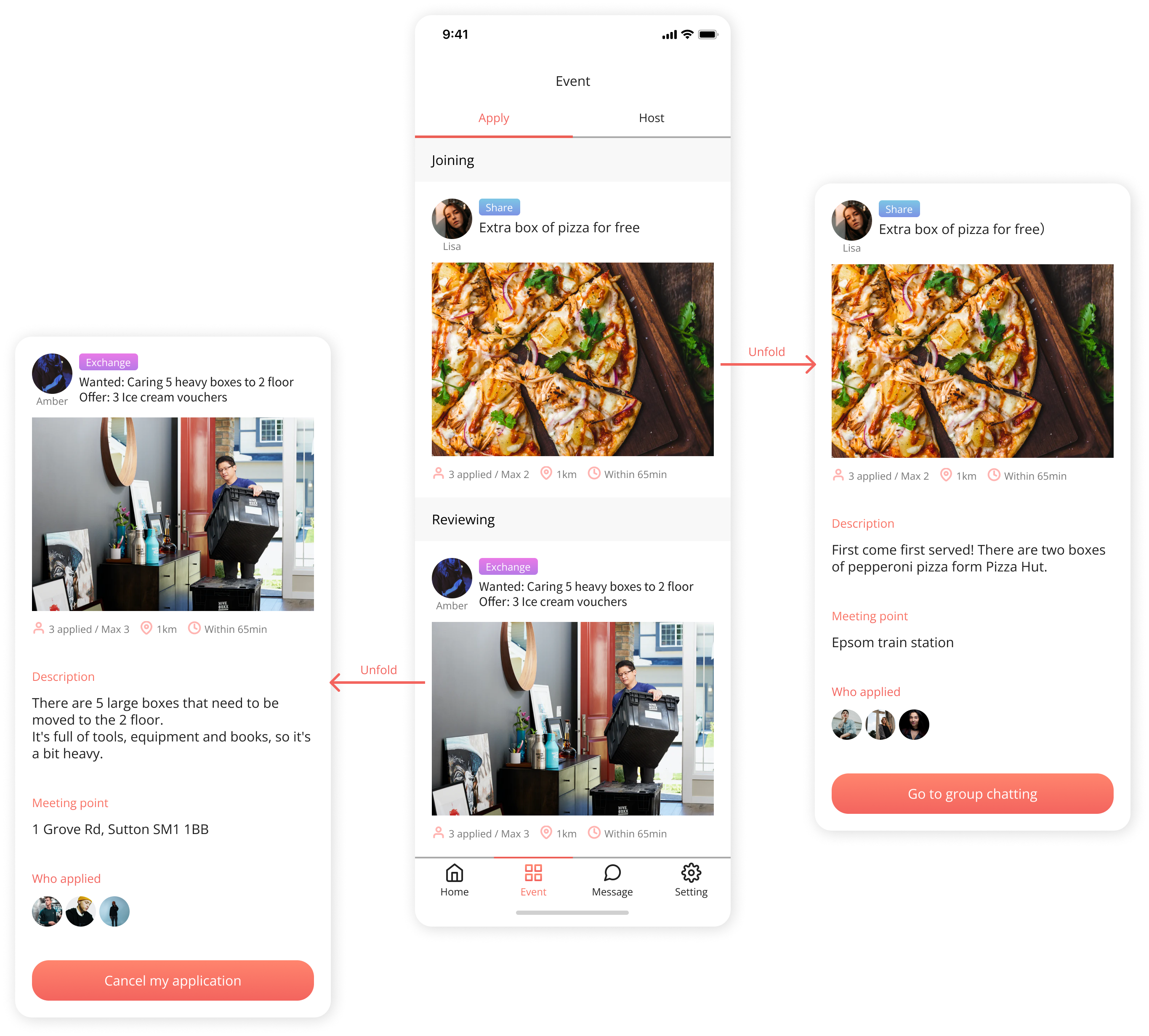
Events I applied
You have to turn your state online first to check here. There are two categories, activities I applied to and activities I am hosting. Applied activities are divided into two groups: to be reviewed by group leader, or still waiting. You can go to the chatting room once you are reviewed or cancel your application anytime when it’s waiting. You can only apply for one activity per mode.
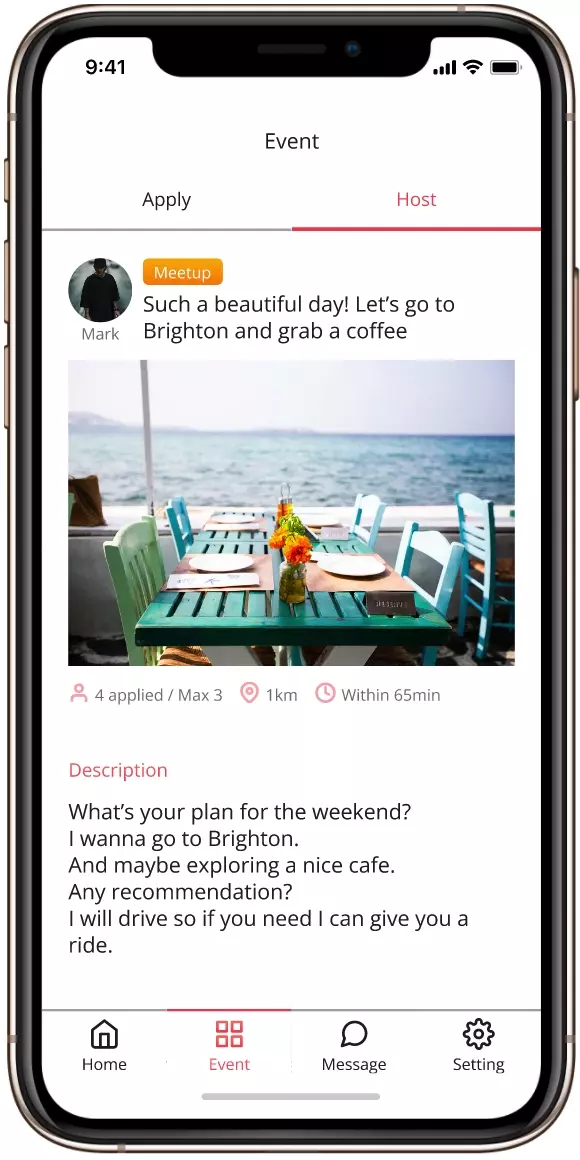
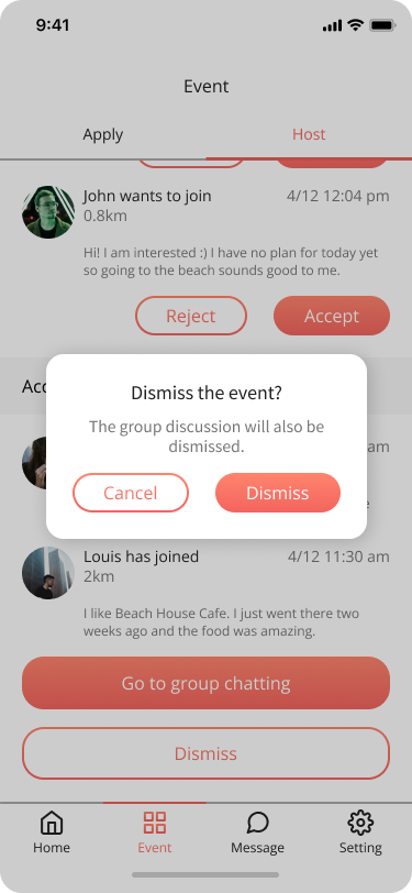
Event I host
You could edit details, review applications and click the finished button to dismiss the group after the activity is done here.
Message
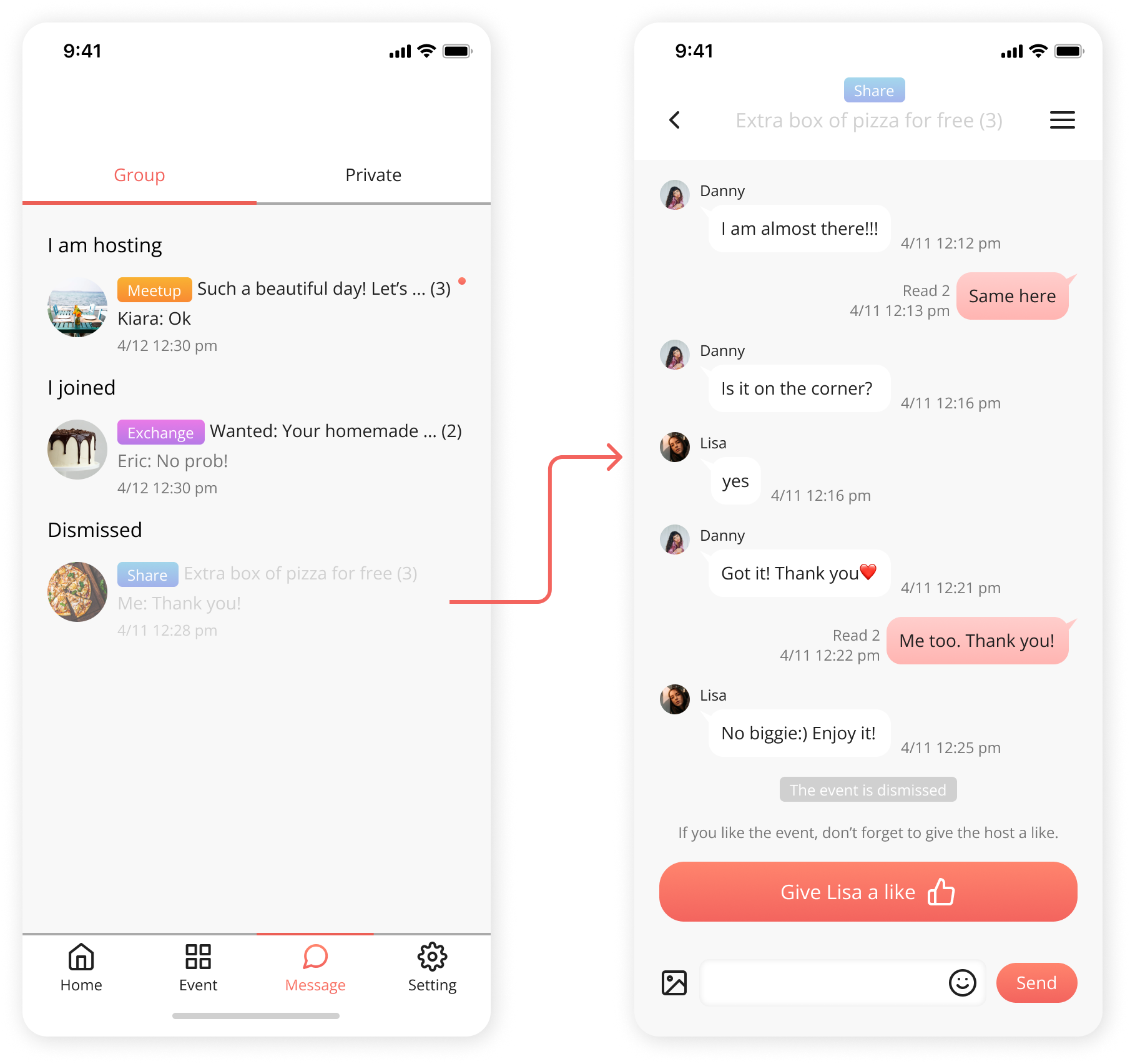
Group chatting
After holding or joining the activity, users could discuss here. When the activity is over, group members could give the group leader a like and it will show on his/her personal page.
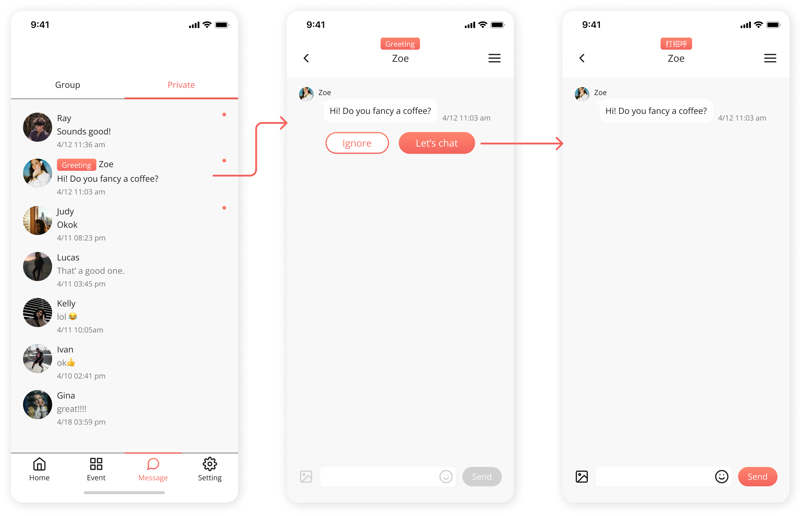
Private chatting
Here shows greeting messages from others. Only if both parties agree can you then start your conversation. This is to avoid being bothered by strangers and dialogues here will continue existing, unlike group chats.
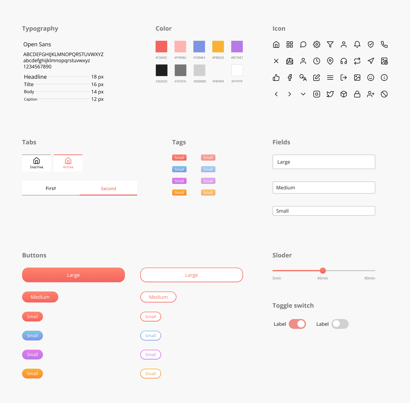
Styleguide
What I’ve learned
.Keep it simple, don’t overcomplicate
Initially, I wanted to add too many functions and concepts, making me struggle to plan the flow. I learned that I should be aware of over-complicating the product and pay attention to setting a precise design scope. It’s important to diverge and converge.
.Embrace more research and let ideas go
It’s engaging to turn my user insight into a product concept. But I still need to do more research to validate assumptions and target users’ pain points. It’s rewarding to continue iteration.
